



Process
Project boundaries
Senior project!! A semester-long endeavor like this needs some serious thought. Our gallery theme was POV: Showcase an issue/question and all its viewpoints/answers in an unbiased way. The goal is not to convince anyone of a side, but to show of them equally, so that viewers could learn more about other viewpoints and walk away with more understanding, to combat polarization instead of adding to it.
I thought very long and hard about my topic. At first I wanted to do something lighthearted, because silly things are my forte, and went through a ton of ideas, but i ended up choosing a very serious topic. If I had to spend all semester doing one thing, it had to be meaningful. The topic I chose was: Is humanity good or evil? It's a very broad topic, but everyone has thoughts on this shaped by their past experiences. If humans are evil, why are we nice to strangers on public transportation? But if humans are good, why do we keep launching genocides against each other? The bottom line is, no matter what you believe, we can't despair at the evil or turn a blind eye. We have to make the world a better place ourselves.
Visuals
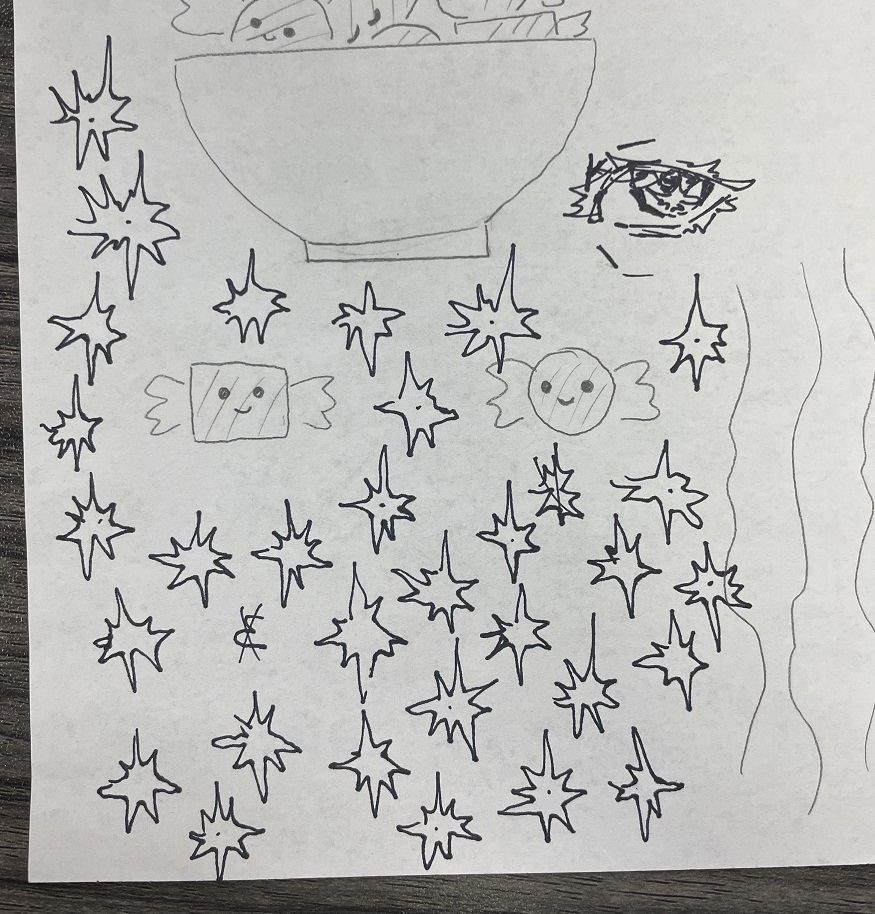
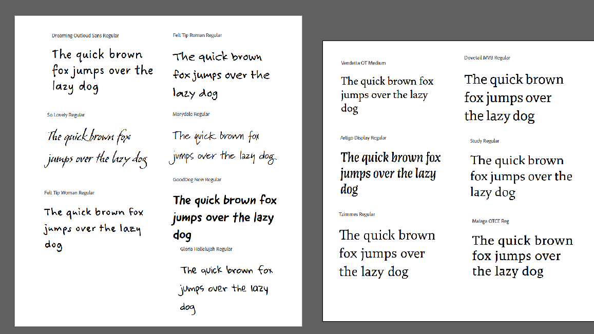
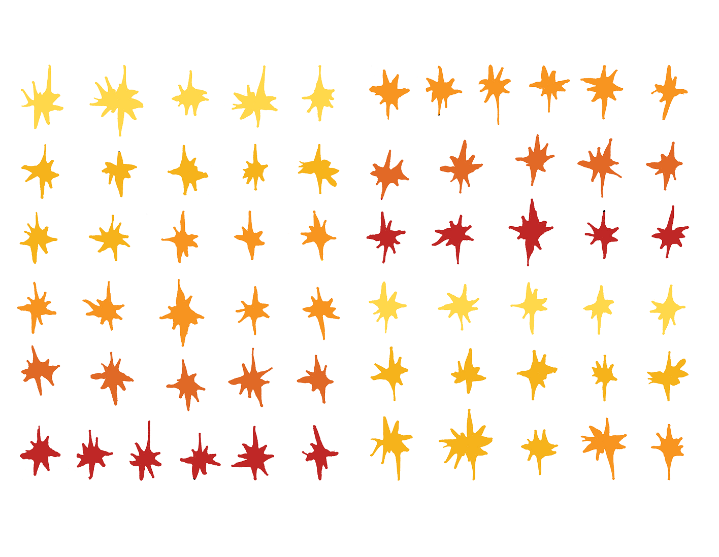
I wanted to include stars, to represent the light that we could choose to be. I hand doodled a bunch of wonky, imperfect stars, scanned them in, and used them throughout the project. I decided to make my color palette in shades of orange, because it can be a warm, comforting color, like a fireplace, or an intense, dangerous color, like a wildfire. I added a dark blue to complement and anchor the color palette. I also chose to focus all my illustrations on hands. Hands can be used to help or hurt, so I thought this was a perfect way to express my topic. For the typography, I wanted contrasting fonts. One display serif, to show the grandness of history and seriousness of human evil, and a handwritten, softer font, to represent small acts of kindness and the good in human hearts.

Logo
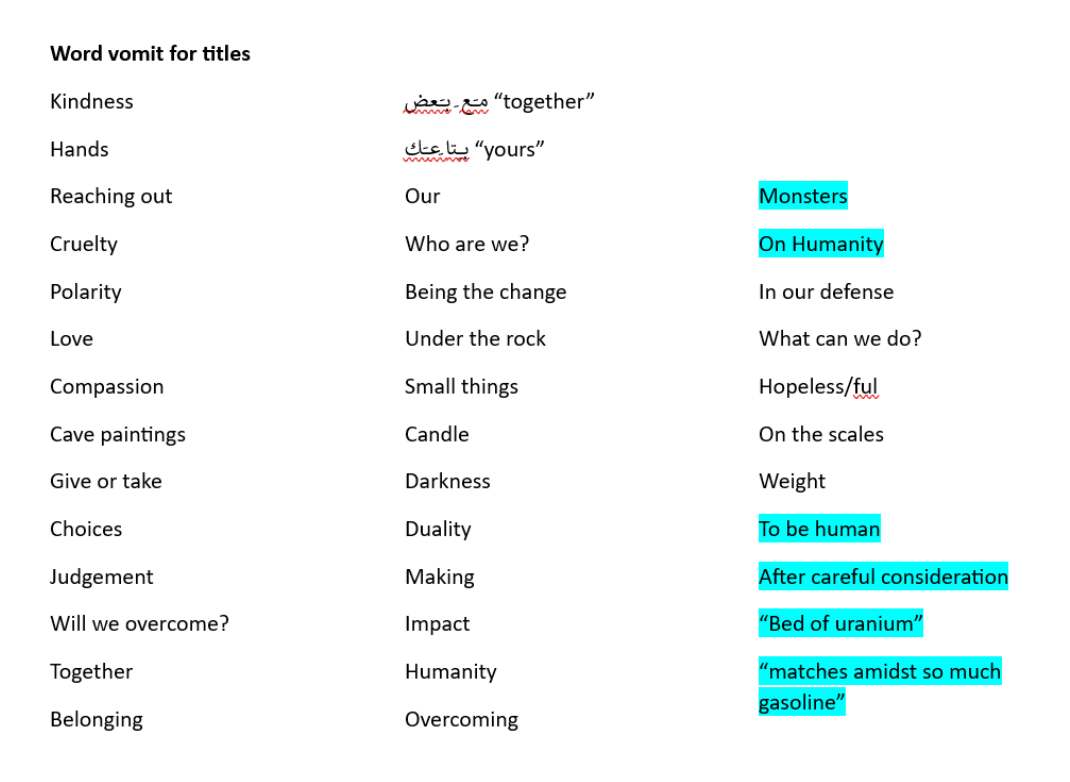
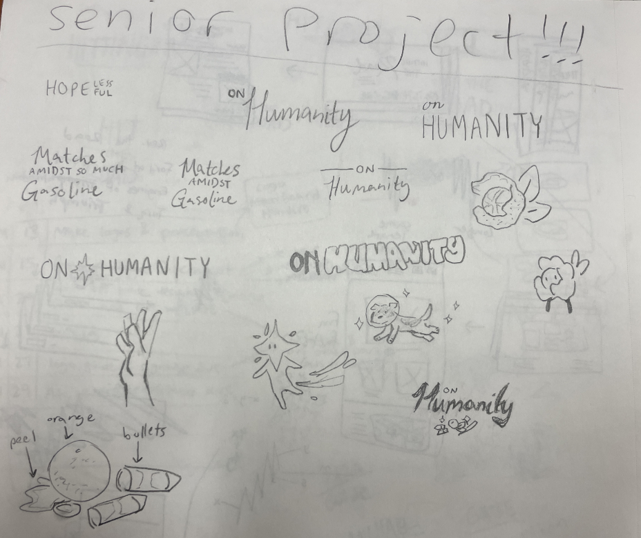
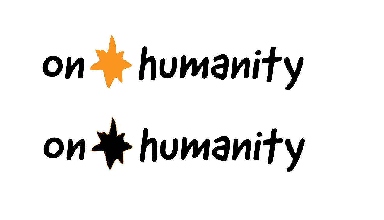
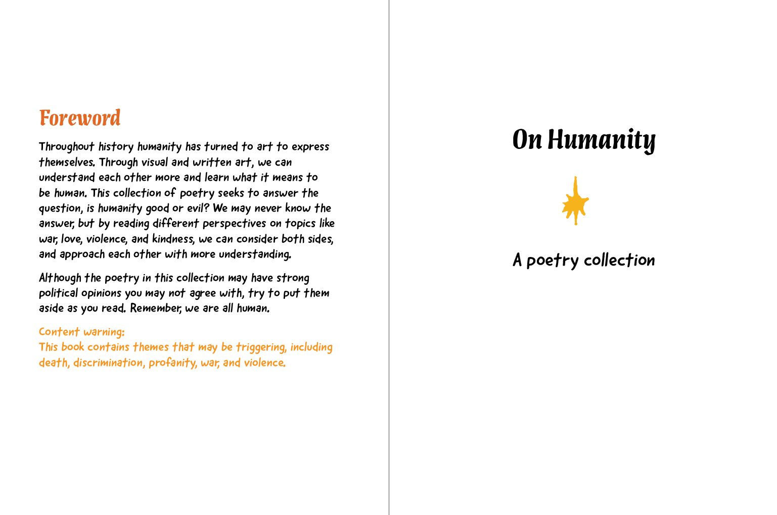
I decided to call this project On Humanity, like a dissertation. After a few sketches, I chose this layout for the logo.
Poetry
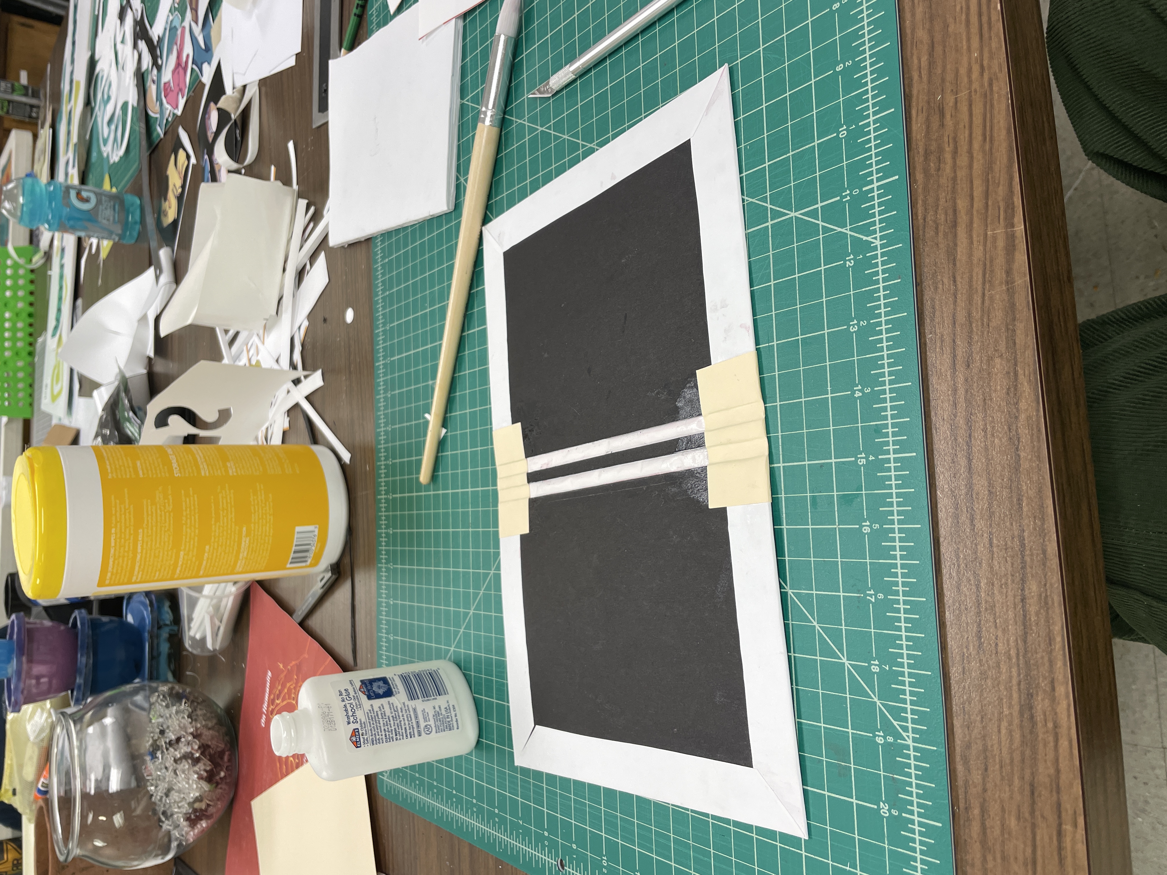
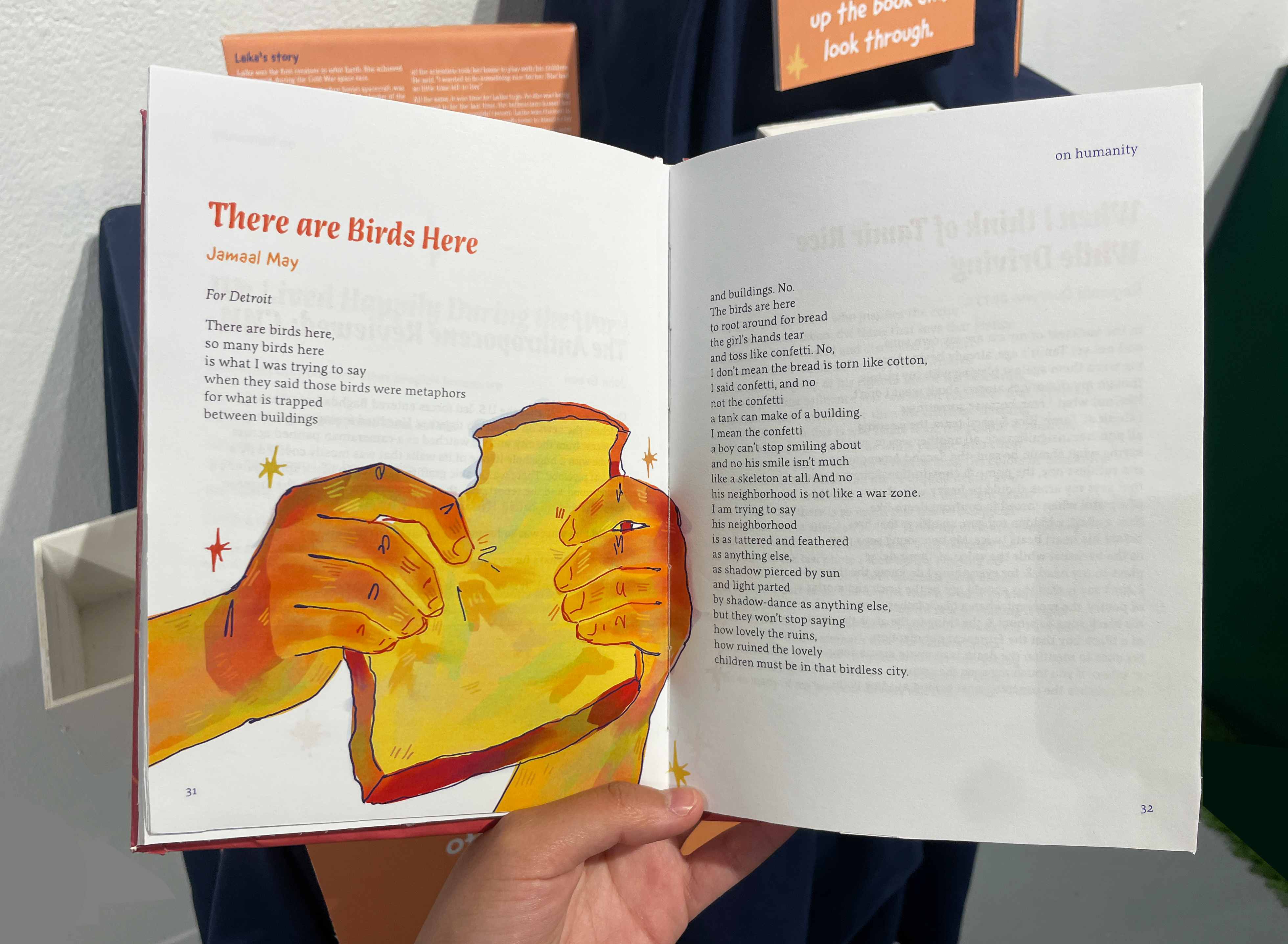
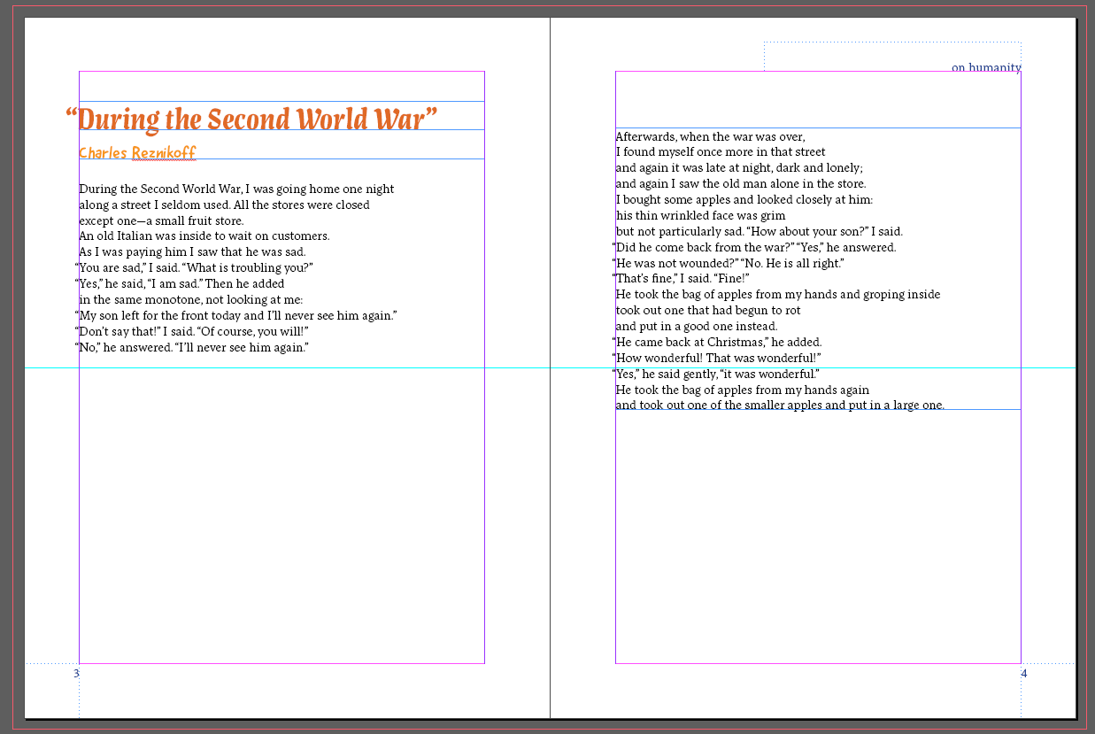
The biggest piece of my project, which i had to start first, was my poetry book. I decided to use poetry because i think it's a good way to talk about this topic. They're firsthand accounts of emotional things, whether it's love, violence, war, friendship, or kindness. The poetry foundation was a very helpful resource for this. I read a ton of poems and chose 50 of them to put in the book. I wasn't much of a poetry fan before, but this project made me appreciate it a lot more. For example, i chose "During the Second World War", because it showcases a small act of kindness as a light in someone's day during a miserable situation.
For the text layout of this book, I put all the authors' names in the friendlier handwritten font, the body copy in the serif font, and the titles in the display version of that serif. I made sure the spacing was the same for each poem, and turned on hanging punctuation to make sure I had clean margins.
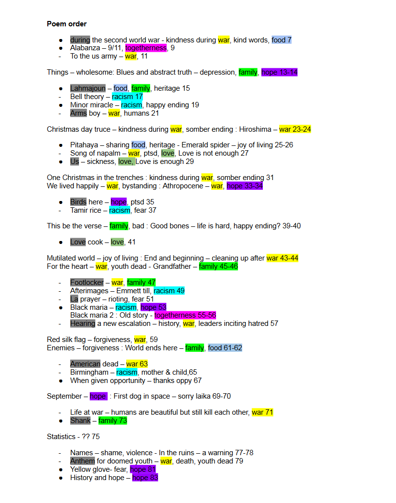
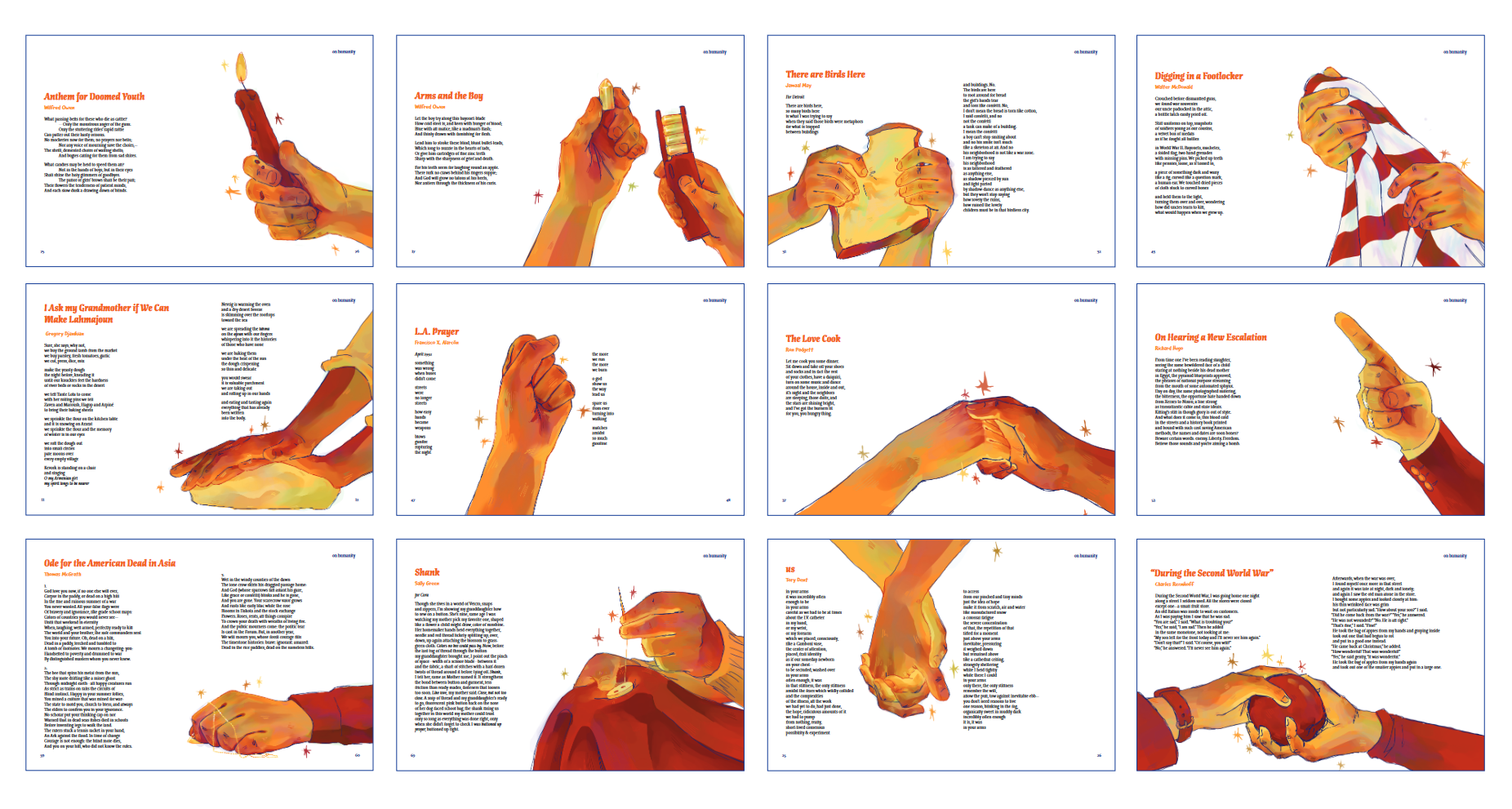
I arranged the poems to make them flow, and evenly space the positive and negative and illustrated ones. Lastly, I know these topics can be very upsetting, so I put a content warning and "author's note" at the beginning of the book.
Illustrations
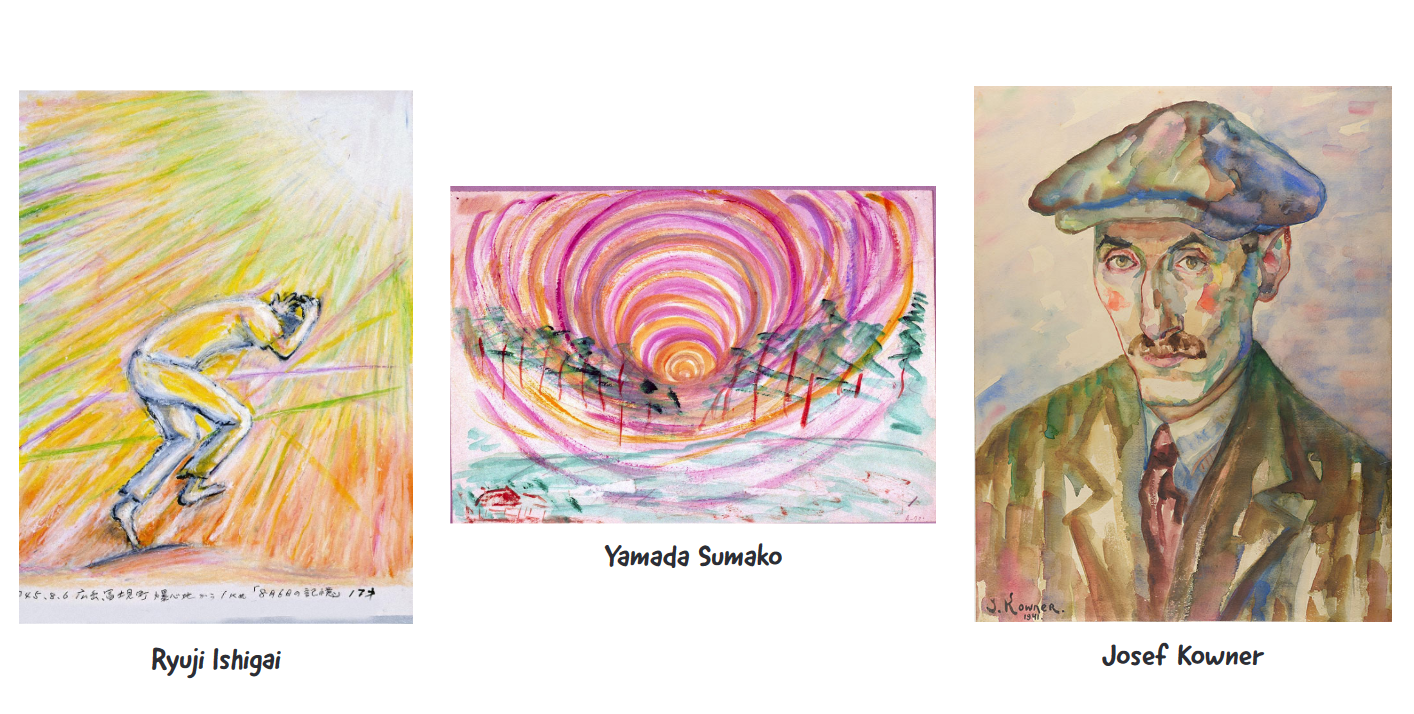
For my illustrations I wanted something that was messy, real, and symbolic. I gathered a moodboard of references. At first I wanted 2 different art styles, to show the 2 different opinions, but it's not so black and white, so I decided to just use 1 style and let the reader decide what they think.
I was especially inspired by art made from survivors of tragedies, and these in particular, because they're so colorful. One artist uses color to express something undescribable, and another uses it hopefully.
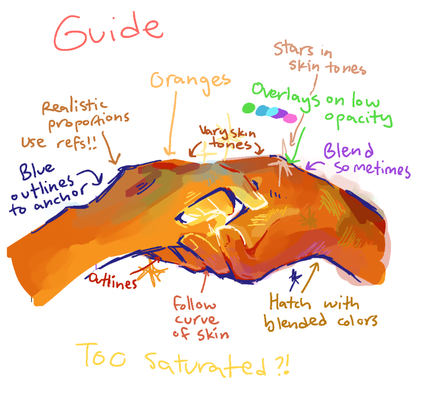
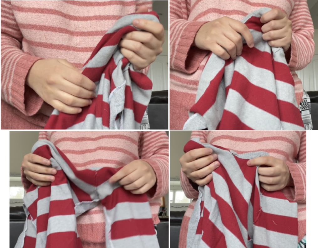
I made this style guide for myself, to make sure I stayed consistent throughout this big project. I took and used lots of references to make sure the hands looked real. So I illustrated 12 poems, putting the artwork big and full bleed on the page. For the rest of the poems I scattered stars on the page.
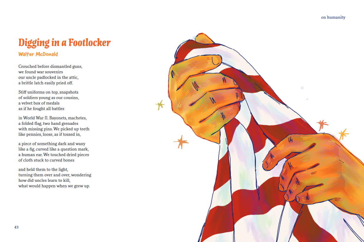
Crisis!
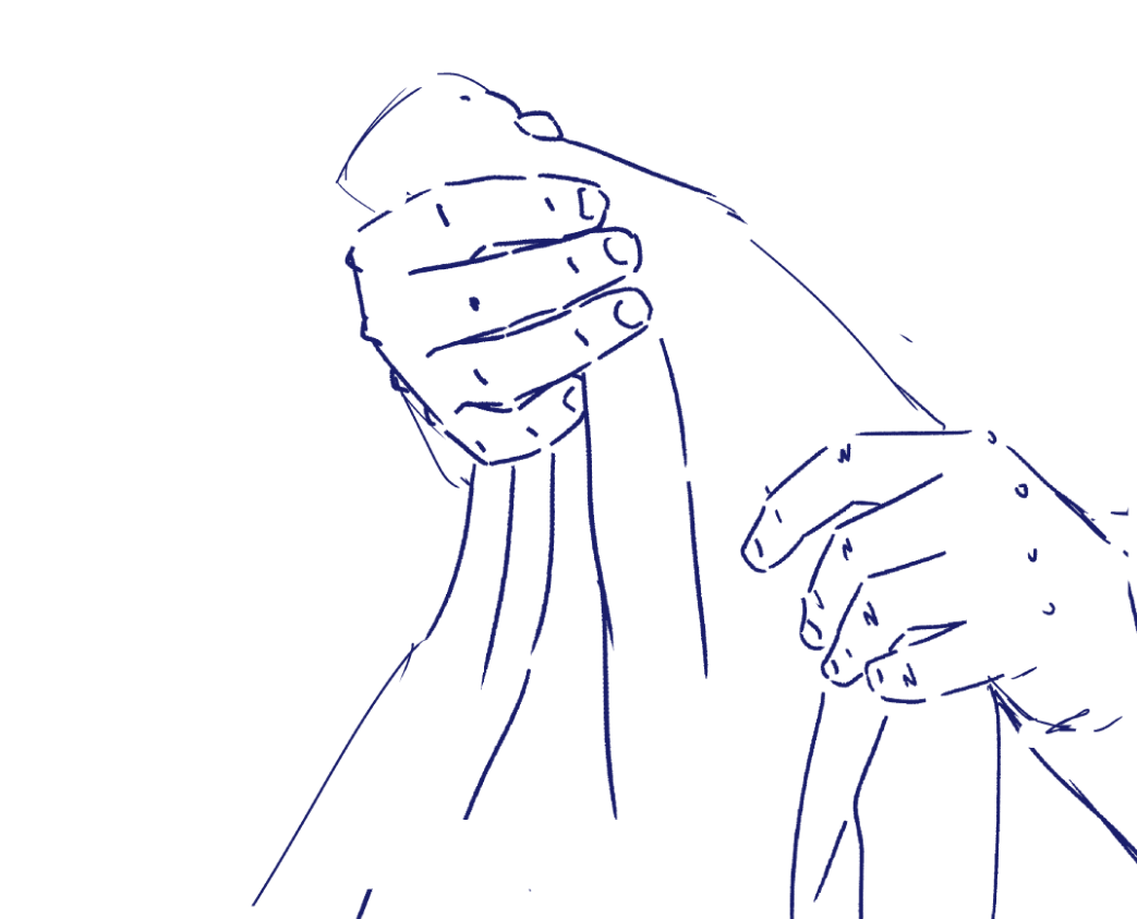
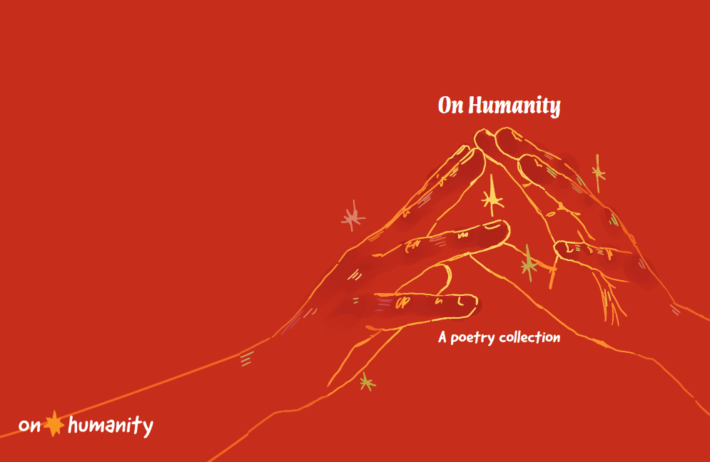
At this point I came across a problem: everything was looking very similar. I considered overhauling the whole project to make it simpler and more "designy," but I thought the painterly illustrations had a lot of life and i wanted it to work. So to add variety i decided to make a secondary art style that was like the first, but only outlines and no fill. I used this one on the cover and through the rest of the project.
App
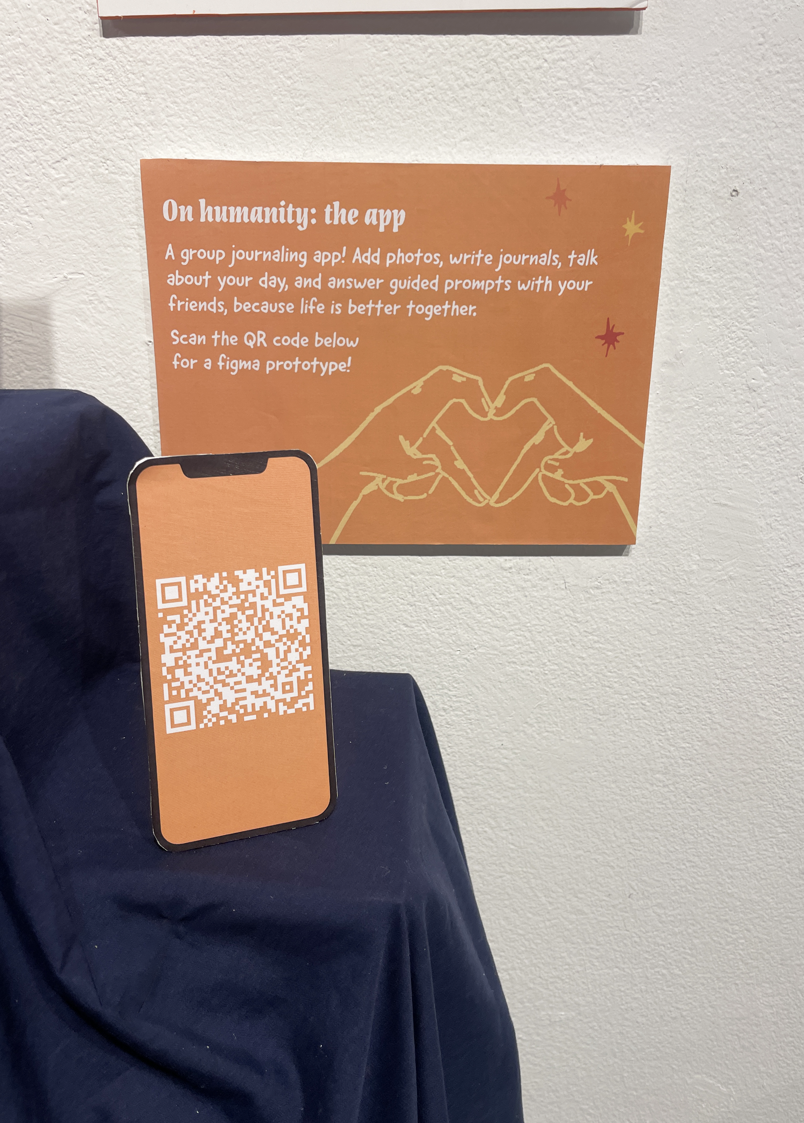
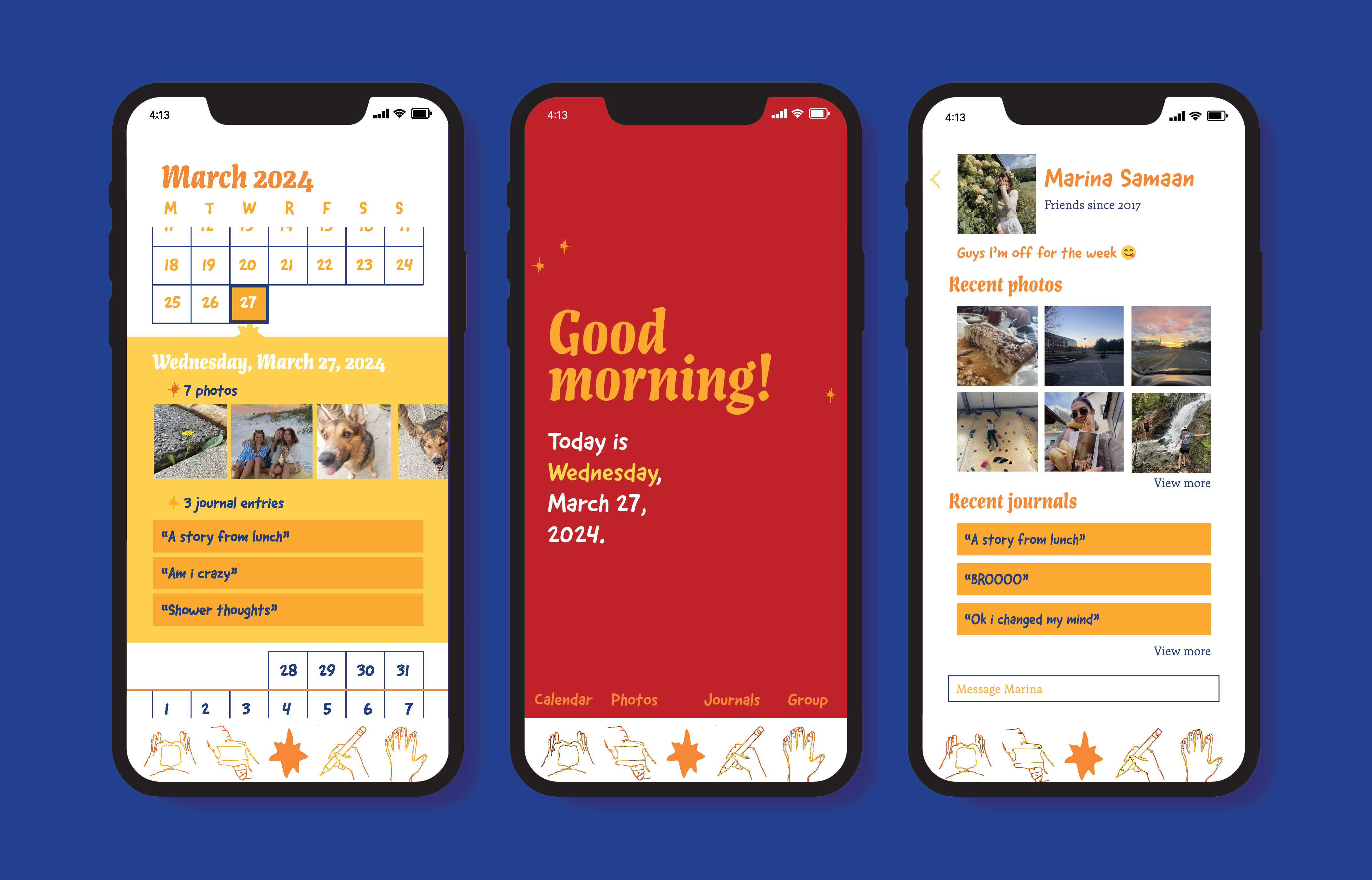
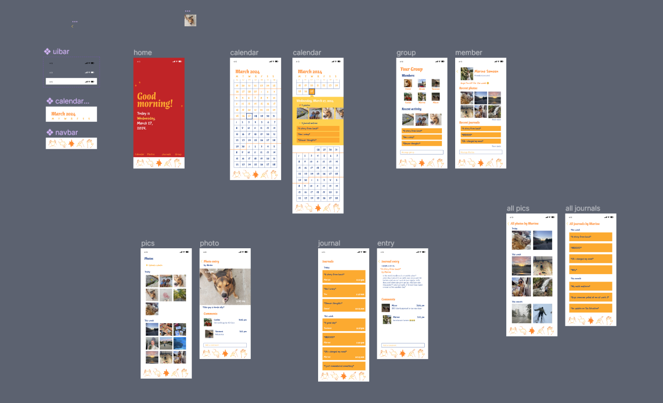
My second item was a reflective journal. At first I was going to make it a paper journal, but I decided an app would give it a social aspect and let me work on my UXUI skills. The features I included were photos, written journals, a calendar, and a group. I made all the app icons hands, to go with my theme, and made them in a very simplified version of my style. Then I prototyped it all in Figma. You can look through it yourself here.
Plushie
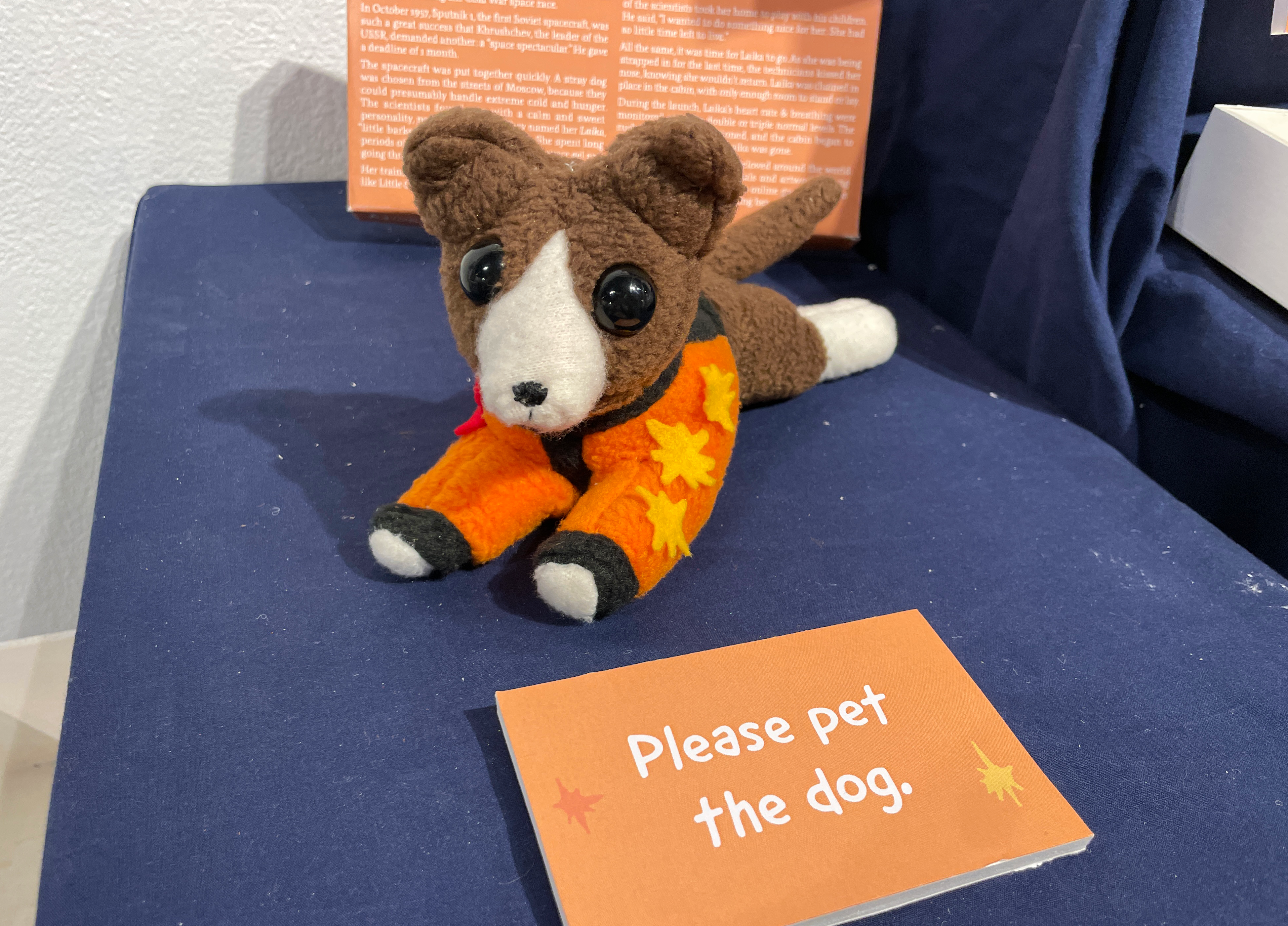
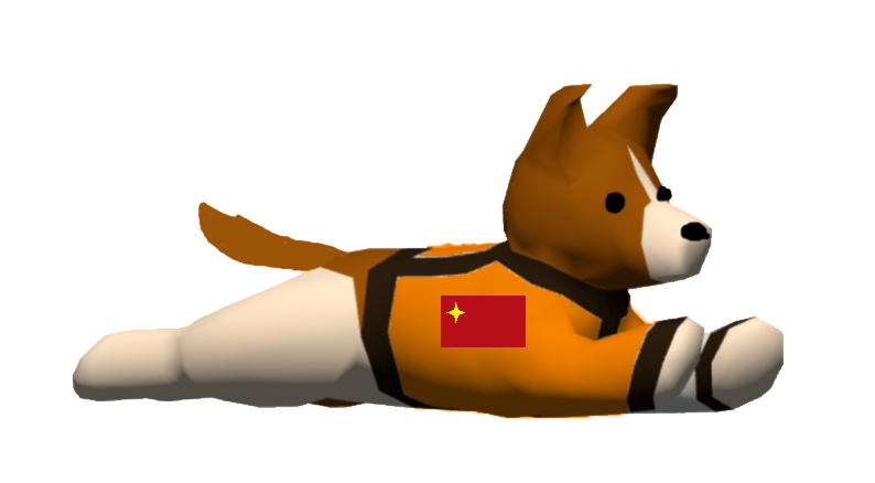
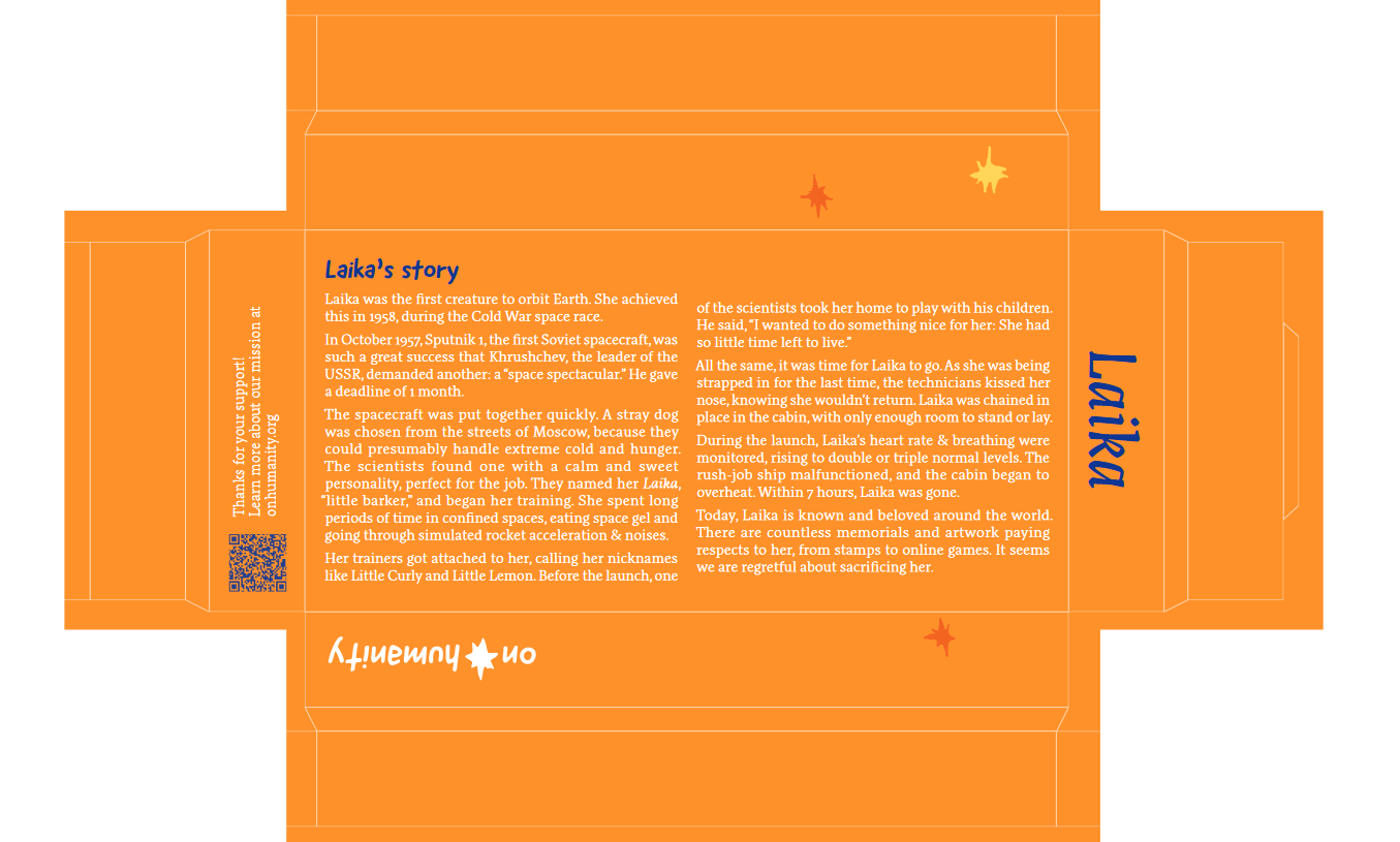
The next item I made was a plushie. A cute collectible item based on a true story, to teach and to cuddle. The story I chose to showcase was abot Laika, the space dog. She was the first living creature to orbit the Earth, but because of our pride and negligence she died a painful death alone in space.
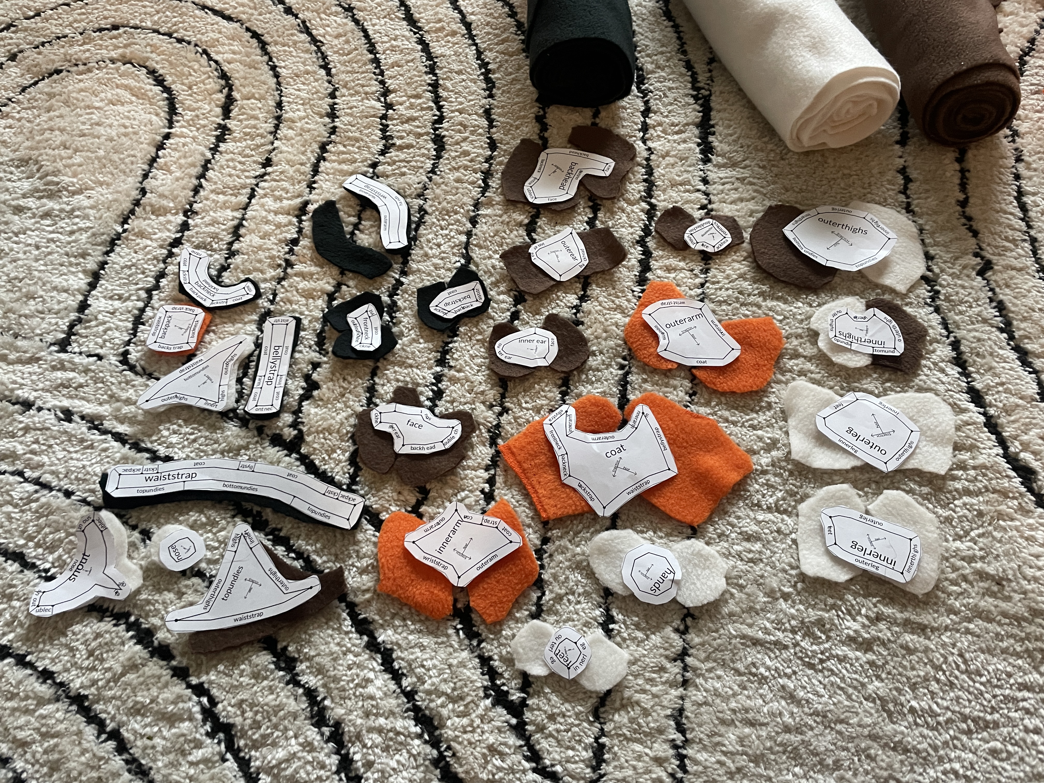
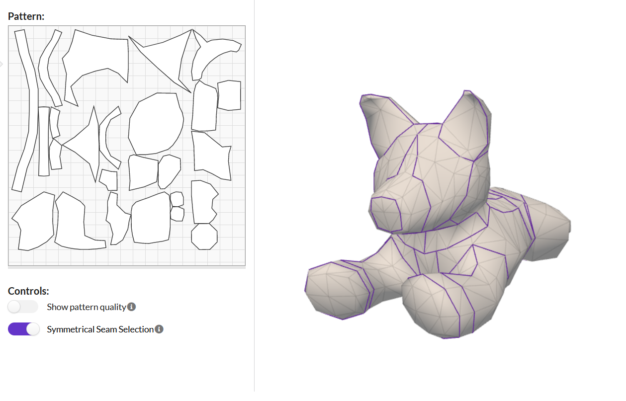
To start I modelled her in Blender. It was tough to capture her likeness, especially with limited photos. The next step was to put her into Plushify, a free website for making plushie patterns. I sized her properly, drew seams, labelled all the pieces, and printed out the pattern. Thus began the extremely long process of crafting a plushie. She was too small to use a sewing machine, so I stitched everything by hand. Then I added stuffing, attached her eyes and a few surface decorations, and she was done!! She's a little wonky but i love her.
For her packaging, I made a tray type box with her story written on the bottom. I designed the cut for her box, but it didn't turn out as straight as i wanted because of time constraints.

Sweater
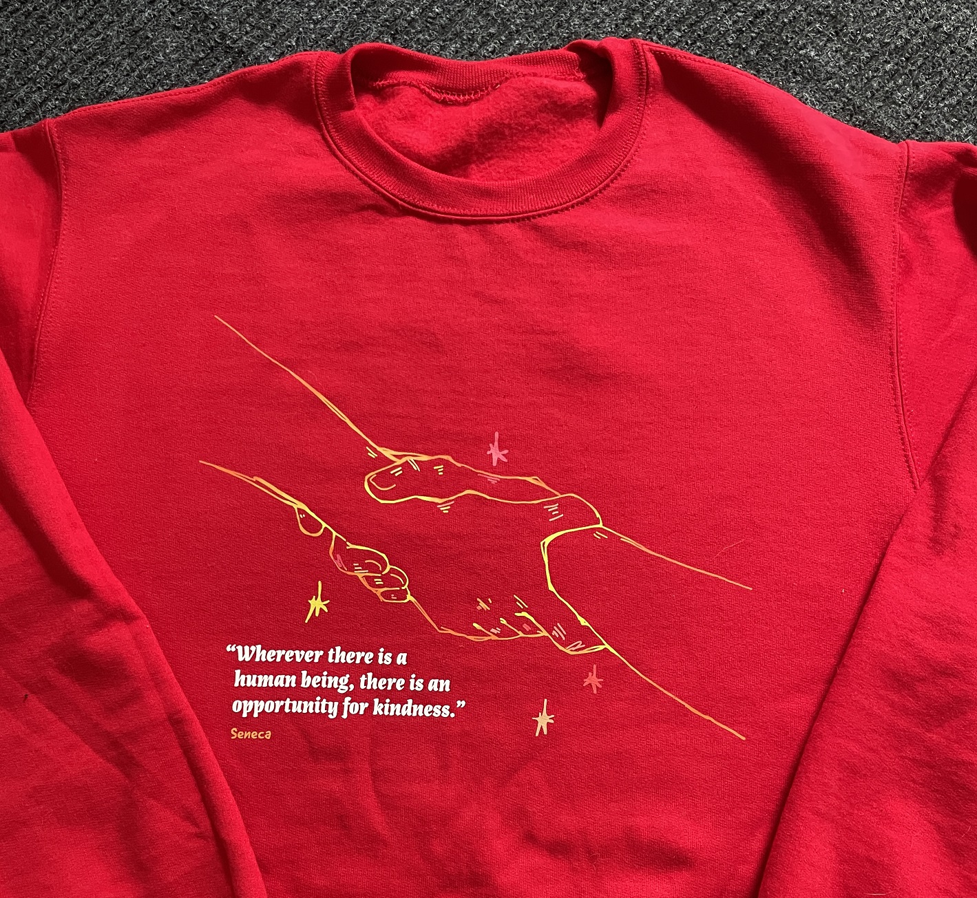
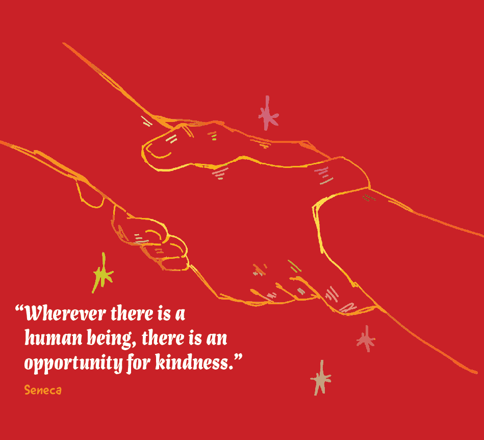
Another item i made was a sweater, to spark conversation and spread the message. I used my outlines-only artstyle and included a quote to inspire viewers. I sent it off to print with sublimation printing and it turned out great.

Another crisis?!
My final major item gave me some trouble. Originally I wanted to make a video game, because I can and it's fun. I wanted to make a game about a true story, where someone does something evil and you have to decide if they're guilty or not, based on the situation, context, and their background. I found a perfect story and researched it, but I felt like it was unethical of me to use this story without consulting the victims' or criminals' families. It felt like true crime, and although I wasn't profitting off of this story, I decided against it.
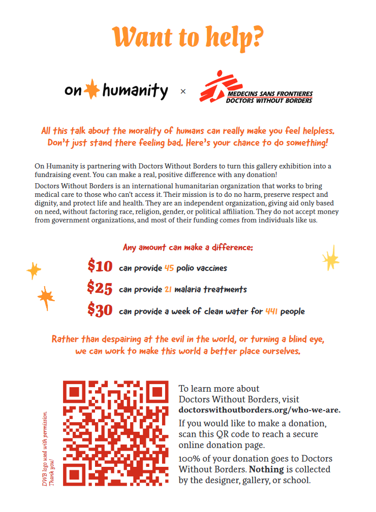
So this left me with a big hole instead of a 5th item. I thought about it for like half the semester. I didn't want to do anything to make this topic too silly or too commercial. I wanted my project to be educational and helpful. Then I thought about the original message of my project: to be the good you want to see in the world. So i had an epiphany: make a fundraiser!! In the end it doesn't really matter if humans are good or evil, what matters is what we an do to make this world better ourselves. This whole topic would be useless philosophy if there wasn't a positive change. I researched a few humanitarian organizations, and decided on Doctors Without Borders. They are independent, focused on helping anyone who needs it, and well-known enough to be trusted. So I made this fundraising poster with a QR code to donate.

Stickers
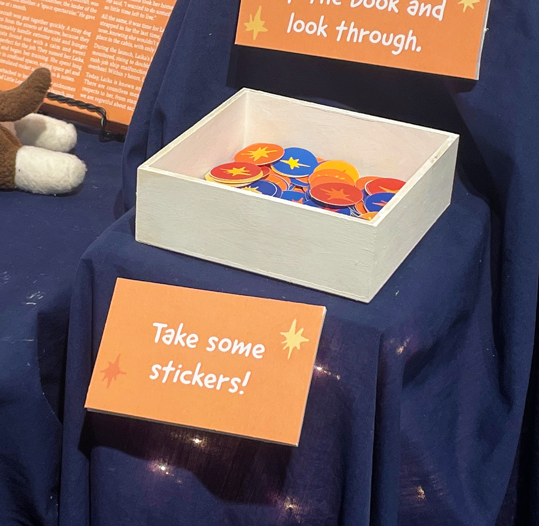
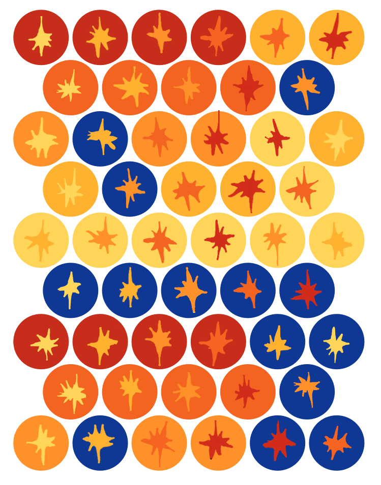
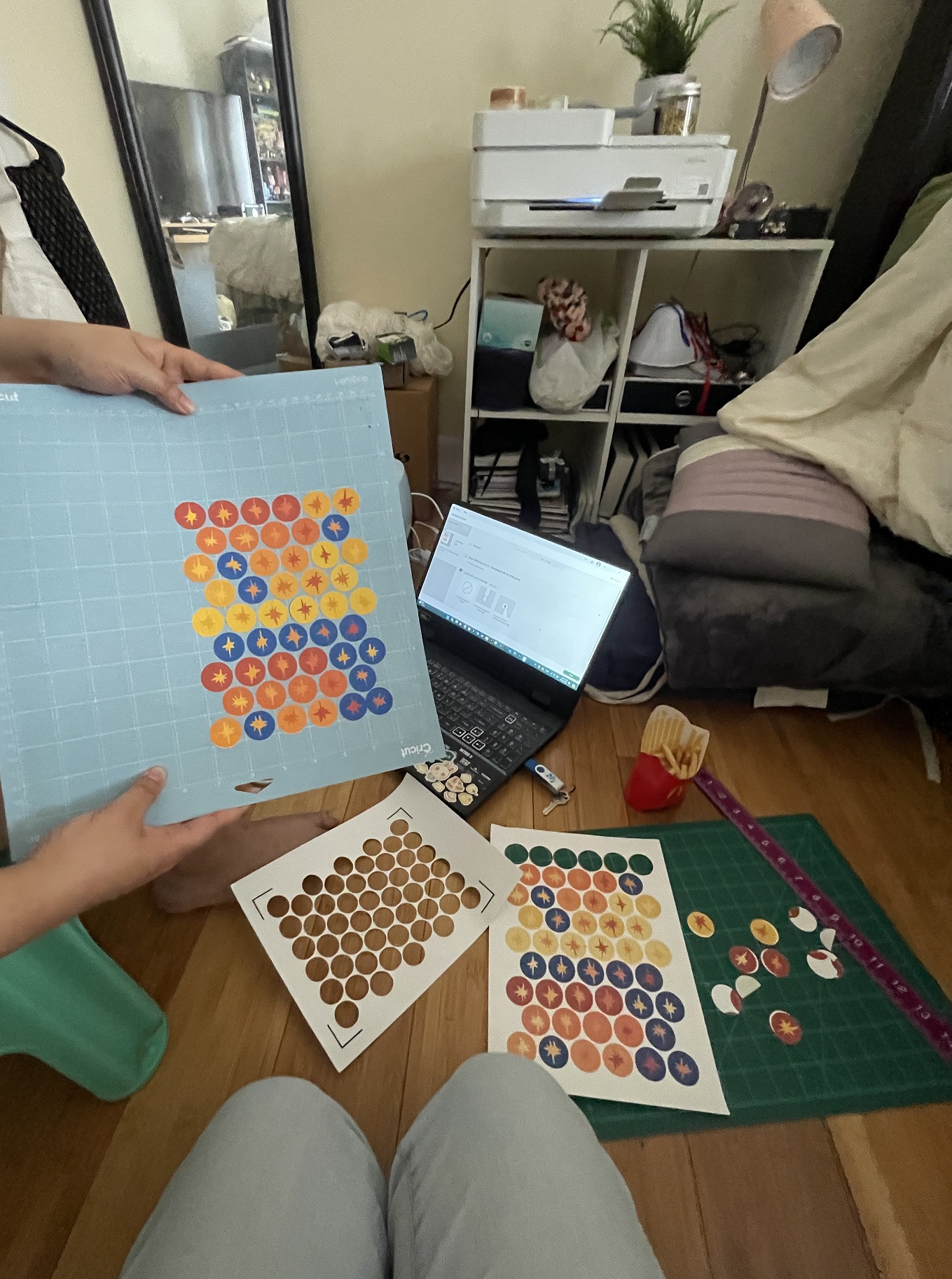
Finally, i had to make 2 small promo items. For my first one i decided to make stickers! I used the stars included everywhere in my project with different combos of my color palette, printed 200 of them, and learned how to use a cricut.
Bookmarks
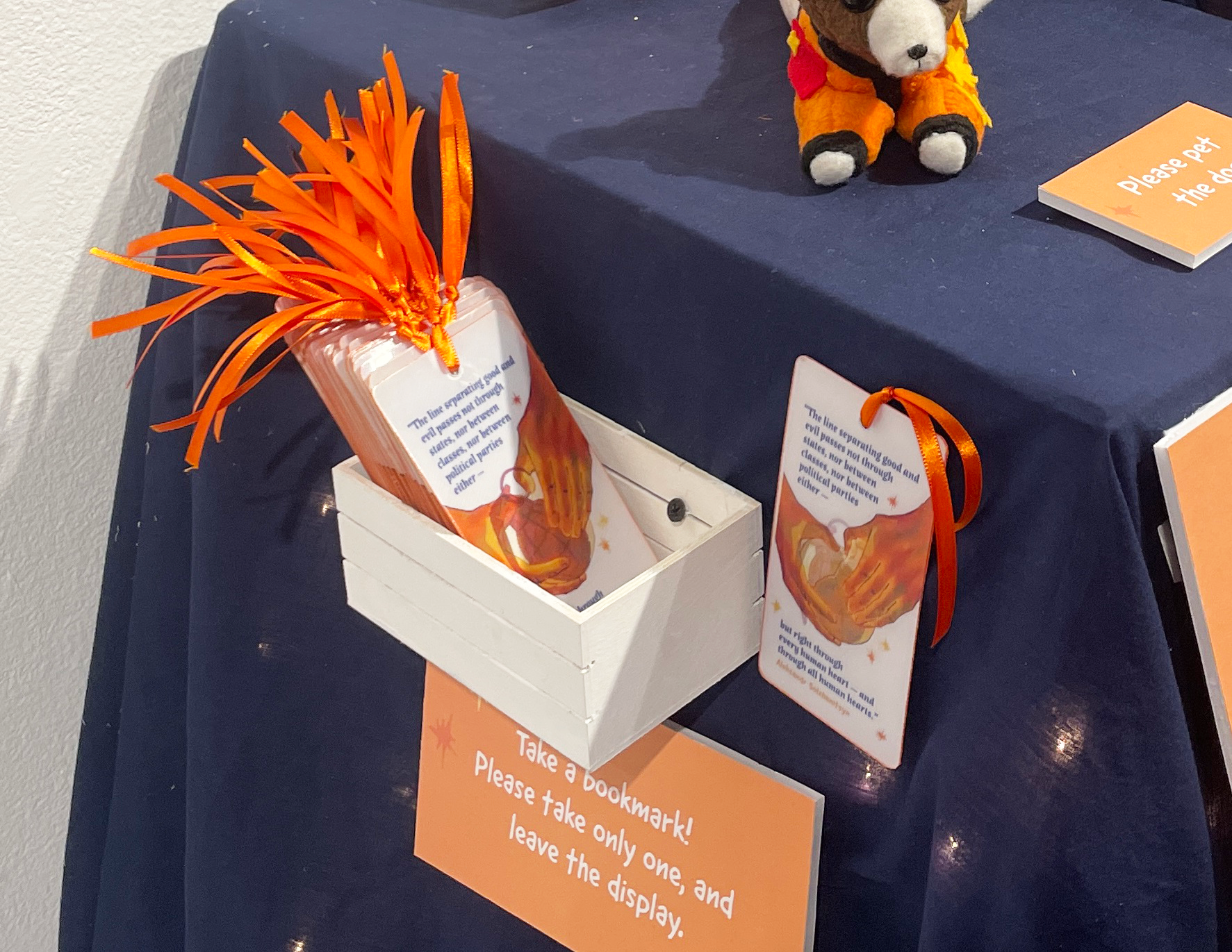
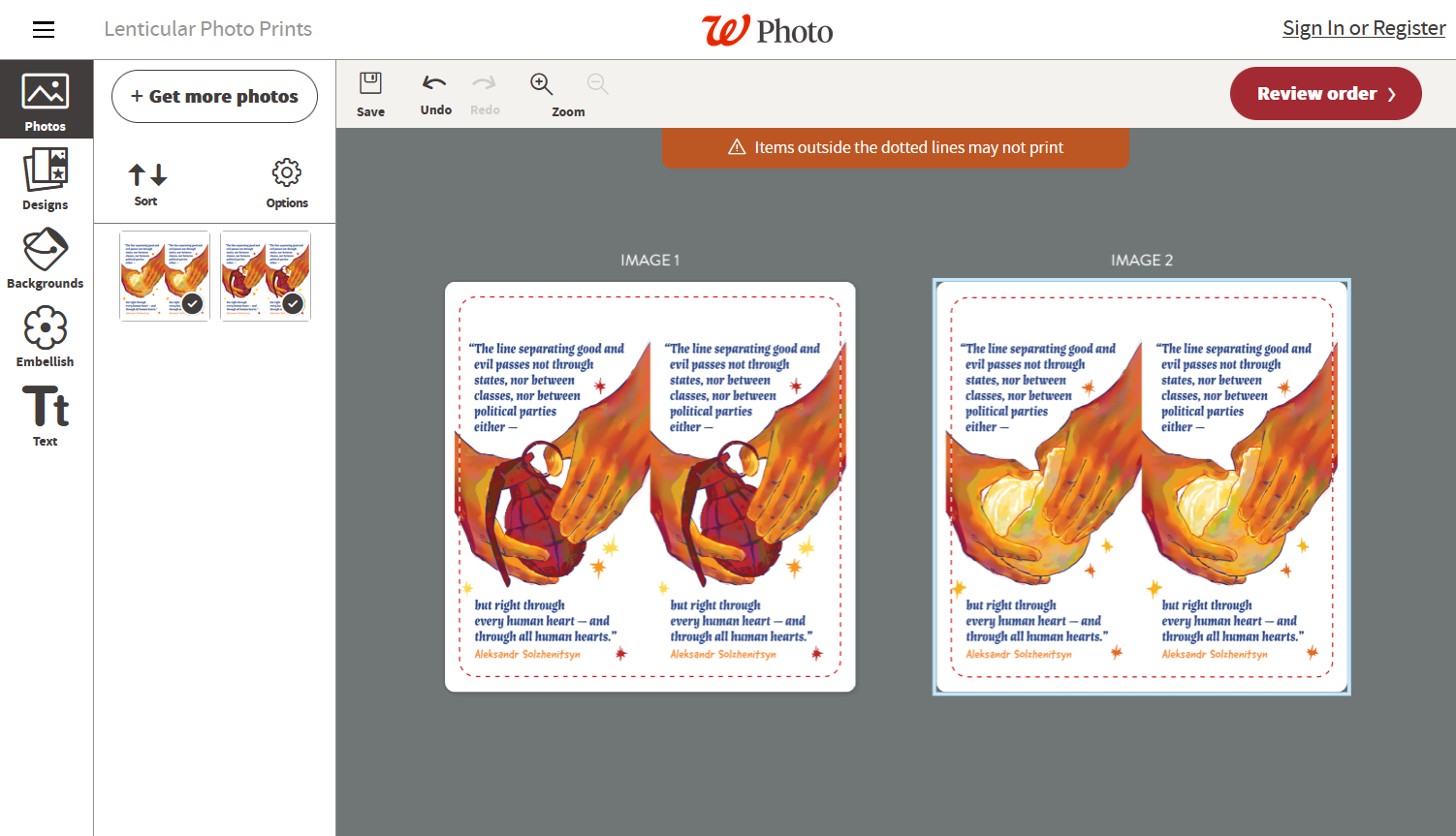
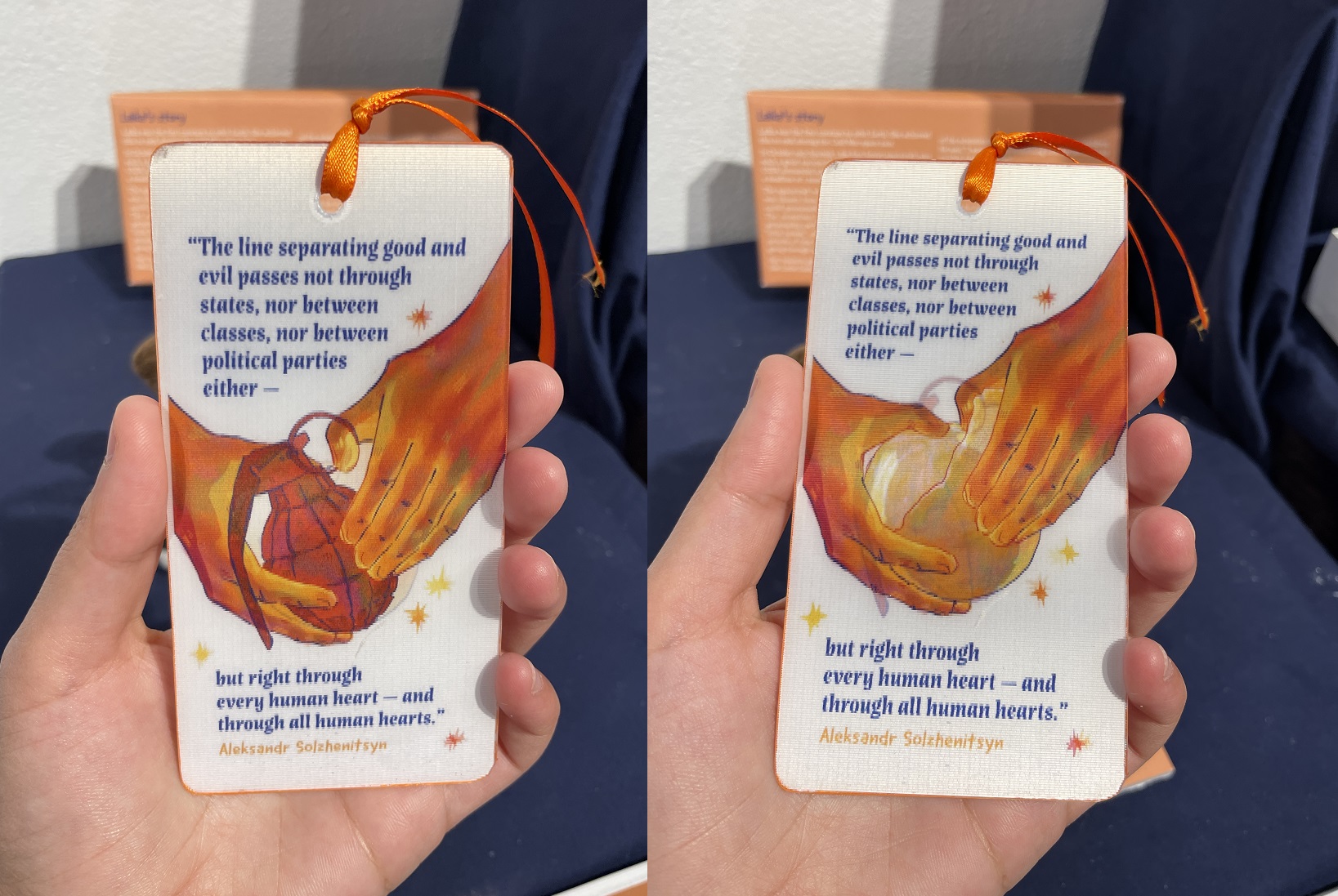
My second promo item was holographic bookmarks. I originally wanted to make a holographic poster, and did a lot of research on lenticular printing, but I found that making them yourself is really difficult and ordering them is really expensive. So i compromised by ordering bookmarks, which were affordable because they were small. I found another quote, similar to my sweater design, about how we all have a choice between good and evil, and used it on the bookmark.
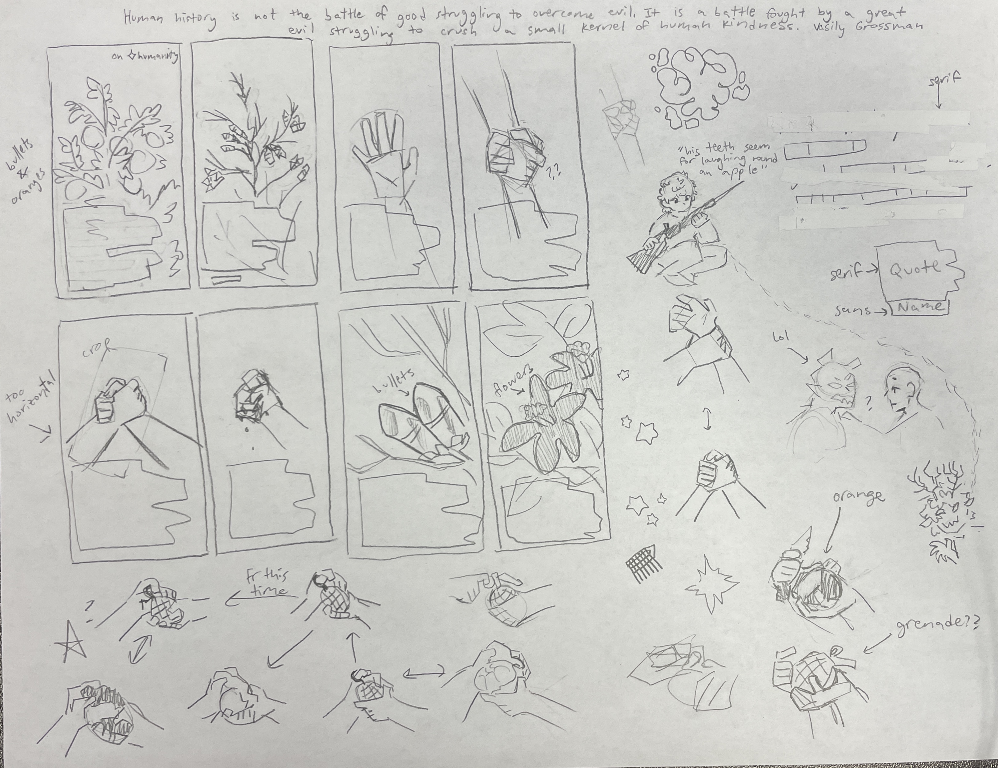
For the bookmark illustration I wanted to make something really conceptual, to represent the idea of choosing good or evil, and how it's in our hands (haha). To symbolize good, i drew an orange, which is meant to be peeled and shared. To symbolize evil, I drew a grenade, used for violence in war. The hard part of this was finding a position for the hands that could hold both an orange and a grenade. I ended up with this layout, put everything together, and sent it off to Walgreens to print.
To be honest, I had no faith in Walgreens, I was sure they would come out horribly. My backup plan was to use the same design, but put it on double-sided paper. But they came through! They looked amazing!
Finishing these bookmarks was a very experimental process. I had to cut them in half, which i managed to do with an exacto knife. Then i had to sand the edges and round the corners. Then I had to poke a hole in the top for a ribbon. I did this with the help of the woodshop and drill press (thanks steven). Then i made labels to stick on the back with my portfolio in case anyone who picked one up wanted to find me again in the future. Finally, I colored the edges with a paint marker and attached a ribbon to all of them. Phew!!

Schematic
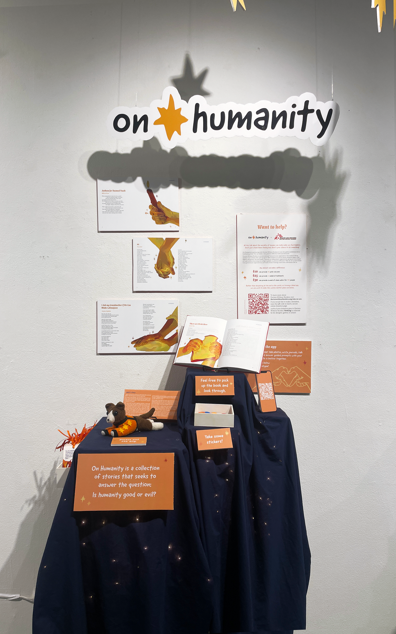
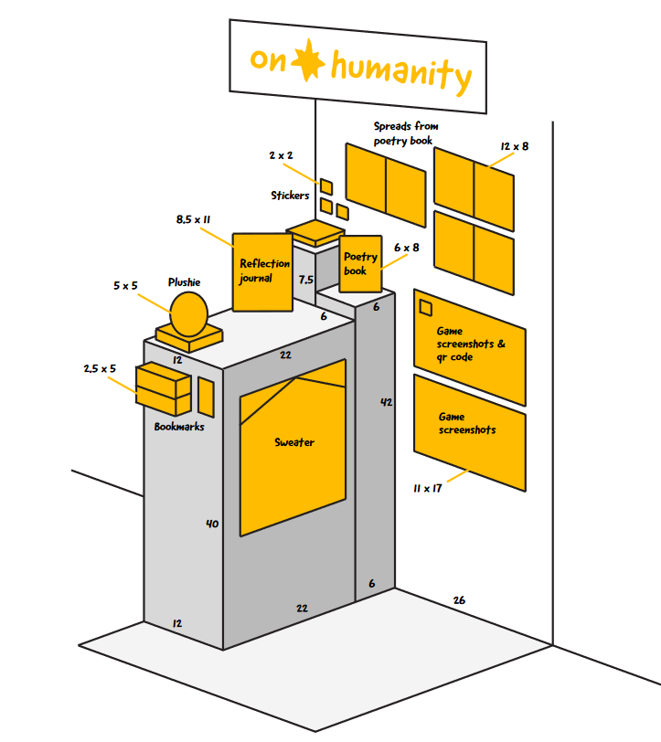
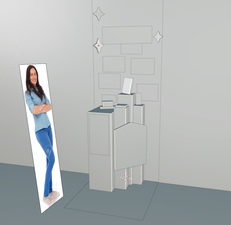
Last but not least, I had to arrange all the pieces of my project in my display, about 3ft wide and 8ft tall. I made a schematic in illustrator, and then again in blender, and then did a few more tweaks as I was arranging everything. I colored my schematic as well to try to balance the colors.
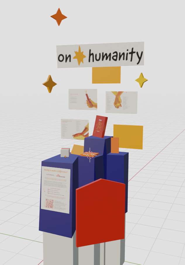
Production week!
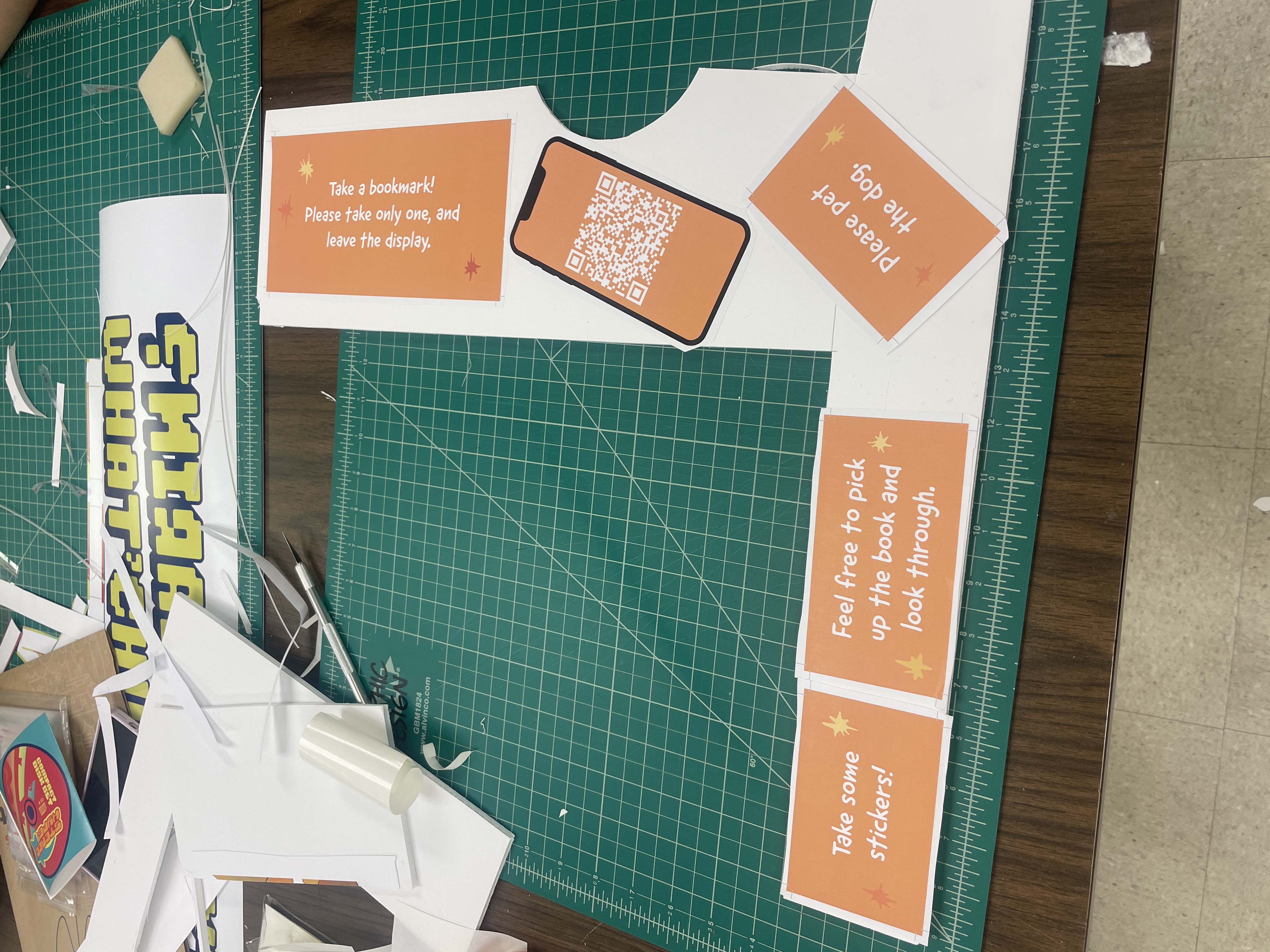
I printed and bound my book, stuck a ton of things to foamcore, and finished my plushie. I printed some of the illustrated spreads and the fundraiser to hang on the wall. I made a bunch of QR codes, quit my job, and made little signs for everything, stuff like "Take some stickers!" and "Please pet the dog." I adjusted my layout a few times, hung some stars from the ceiling, added a tablecloth and stuck it in place, and added some lights underneath the cloth. Etc etc etc etc.
The gallery opened on Saturday, we celebrated with pizza and I was done!! I had a bit of a love/hate relationship with this project throughout the semester, but I am proud of how it turned out.

